

My nephew has done that camp before, but I've never seen jersey designs like these in Columbus. Are we getting a sneak preview of the new third jersey design?
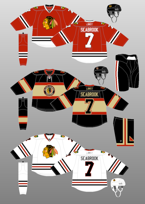
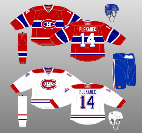
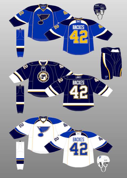
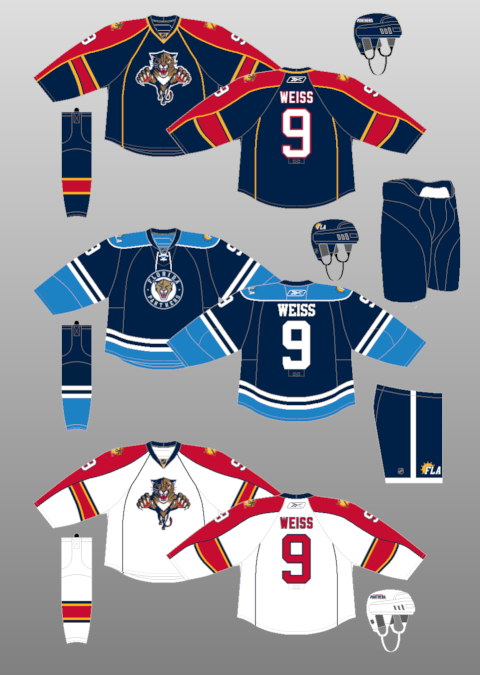
Presuming that this is an early release of the new third jersey, here are my early impressions: 1) Looks like grey on the top and bottom, which I say because the jerseys look darker than the ice (in that dark photo). 2) The "center stripe" look is a reinterpretation of a vintage style, with Chicago using them on their Winter Classic/thirds to much acclaim. (Of course, the Habs have had that look for what seems like forever.) 3) How much money do you want to bet that the cannon design on the front will be in a circle-styled seal look like the Blackhawks' logo on their thirds? Or St Louis' third jersey design? Or Pittsburgh's? Or Florida's?
What are your thoughts? Am I totally off-base in thinking that we got our first look at the new jersey design? Do you like what you see so far?
UPDATE: It appears that the jerseys are custom-made by Ace Sports. Using their online "build your jersey" tool, I was able to approximate what I saw using the "Fox" template. This pretty well tells me that this is NOT the third jersey. However, as CBJGreenSeater says, "Still could be a similar design though," which I don't doubt. But we're now deep into wild speculation...the jerseys in the photo are pretty clearly NOT the new CBJ thirds.
UPDATE 2: The truth, right from the source.
It doesnt reach out and grab me, I'll say that. I'm not a huge fan of the big center stripe.
ReplyDeleteI like the idea of the grey, not too common in hockey. By the way, you guys in Columbus better do some good this year, we lent you our coach from Manitoba, make him look good.
ReplyDeleteThese are just the Jerseys for the camps.. the ones in the past don't look too much like the CBJ jerseys.. well except for a CBJ logo on them.
ReplyDeleteIf it's really it, that's interesting, but I'm not convinced...
ReplyDeleteOMG THEY'VE CLONED KRIS RUSSELL
ReplyDelete[but in seriousness, I hope not, I hate the gray, a more blue/red/silver shiny a la Nashville combo with that pattern would be sick though.]
not a blue jacket fan here but I hope its not a center stripe with a seal on the front. It's a nice looking design but how bout some originality? Teams are just carbon copying other team designs and switching the colors up. I don't want to look at a blue jacket jersey and immediately think of St. Louis or Chicago because no one in Columbus has any creativity. Come up with something unique, something CBJ can call their own. (by the way im a NYR fan and their 3rd jersey this year is lacking as well, just a throw back from the late 70's... disappointing )
ReplyDeleteThese are the CBJ Hockey school jerseys. My kid has been at the camp all week and they have been hanging in the lobby of the chillers for several months. nothing to see here keep moving along....
ReplyDeleteThese are not the 3rd jerseys. I participated in a focus group that gave input on design recommendations. This jersey wasn't in the mix
ReplyDeleteI really doubt they are going to go with gray.....might clash with the Union theme we have going on.
ReplyDeleteheres a concept iv made for the jackets.....enjoy!
ReplyDeletehttp://i1120.photobucket.com/albums/l494/cbjBucks61/thirdjersey-1.jpg?t=1290352344