

As I indicated last time, I've got family in town and was unable to watch much of the game. Like maybe a minute. Thus, any insights I might have on that front are not worth sharing.
I was, however, front and center in front of the television to see the new third jersey unveiling during the first intermission. Yeah, I know that I should have been more closely attuned to - I dunno - the actual game on the ice, but I think readers of this blog can appreciate that I've had a strange curiosity about the third jerseys ever since the CBJ announced that one was coming. Here's the jersey:
 |
| Photo from BlueJackets.com |
And, for those who are more interested than the average fan as to how the jersey came to be, here's the link to the video on the whole process.
Gotta hand it to the CBJ - they DID involve the fans in the design of the jersey. I don't know if every team does that or not, but it is to be commended.
As to the jersey itself, here's my initial Twitter take: "Nice, classy, safe. Should be a good seller."
Now, let's take it a step further.
 |
| Klesla, Nash, Umberger and Vermette show off the new unis. (Photo from BlueJackets.com) |
Classy: When I heard that the CBJ were going "old school" in their design, I hoped that they would work from the Canadiens' template. That, in my mind is the uber-classic jersey design. And, sans the chest stripe on the Montreal template, the CBJ pretty much followed along.
The "JHM" initials on the neck trim is especially classy and deserves mention.
Safe: Let's be honest with ourselves. This looks a lot like other third jerseys currently floating around the National Hockey League. Specifically, I think it bears more than a passing resemblance to the current Florida, Nashville, Pittsburgh and St. Louis thirds. I say this not out of criticism but instead as a reflection that the Blue Jackets went for that which apparently is tried and true. Can't blame them for that - heck, their fans apparently steered them in the direct that they took. The fans want a jersey that looks like the other teams. They got it.
Now, the sharper criticism - though not as rough as the Puck Daddy readers. I'll temper it by saying right now that as the jersey is NOT hideous, I'll be buying one (if I don't get one for Christmas).
That being said, I do have a beef with the jersey as it is presented above. I hate the font for the name and numbers. Looks like a real bad download from freefonts.com or some other place of that ilk. Nowhere near as classy as the rest of the jersey design. Luckily, my version won't have that font as I don't put names and numbers on my team jerseys (This Detroit Lions fan once made the mistake of getting a Joey Harrington "3" jersey. Won't make THAT mistake again...).
 |
| Just my opinion, but this Slovakia Olympic jersey by Nike is sharp |
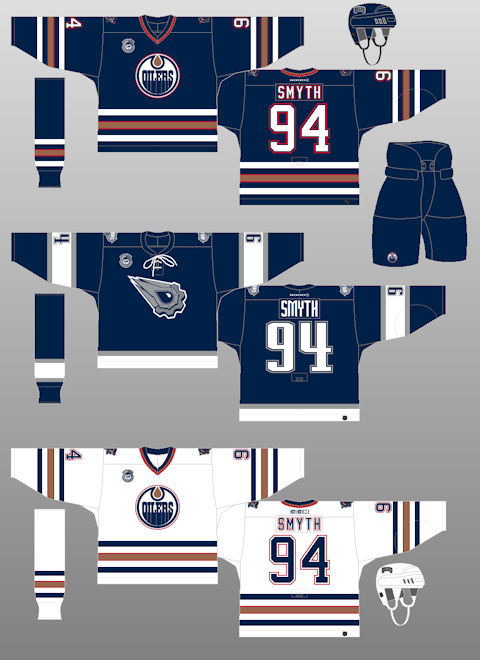
One more thing: I really don't like lace strings hanging off the front of my jerseys. I sucked it up to get my Todd MacFarlane-designed Edmonton Oilers navy jersey, which I consider to be perhaps the best third jersey design ever. I'l suck it up to get the Blue Jackets' new third. But I don't like them.
CBJ Vice President of Public Relations Todd Sharrock suggested to me at CannonFest that jersey designs are matters of personal taste. Some people will love them, some will hate them. Didn't matter what they did. He's got a point.
So let's hope that - love 'em or leave 'em - these new jerseys bring the CBJ a little additional luck and help them take sole posession of the top spot in the Western Conference when they play Detroit on Friday.
Now, about that new mascot...
 |
| "Boomer" (Photo from the Columbus Blue Jackets) |
It's also laughably phallic.
Consider this: The Blue Jackets spent around two years working on the new jersey design. League input, focus groups, etc. Lots of people had a say in this process. One must think that they spent a similar amount of time considering a new mascot.
Can you really accept that no one, anywhere, looked at that design and said, "That looks like a [insert slang for a man's organ]!!" Nobody made this connection?
I can't. And while I can accept the "go with the flow" mediocre third jersey that their design process came up with, I am simply embarrassed for my favorite team and my community when it comes to Boomer.
We can only hope that the Blue Jackets recognize what they've done with this mascot and retire it before it sees the lights of Nationwide Arena, a la the St. Louis Blues third jersey that Mike Keenan refused to have his team wear.
Major, MAJOR #MascotFail.
(Oh, and Stinger isn't going away, either.)
Ha Haaaaaaaaaaaaaa...... "Upright cannon."
ReplyDeleteFor what it's worth, I watched the entire game and thought that in for most of the first two periods the Jackets got away from the puck possession system that's been so successful. Lots of immediate shots from the point as soon as they entered the zone that DiPietro swallowed up. In the third, the squad started to hold the puck and create chances that worked out (that's how they scored the tying goal in the second) and what a great play by Russell to make the game-winner happen.
ReplyDeleteI like them, and while a lot of connections could be made to the other alt sweaters in the league, I feel like the Jackets have a "right" to try and attempt the alt look. The symbolism more than makes up for the "go with the flow" look. The only gripe I have is the logo; which I feel would be better off centered facing the front or criss-crossing. I actually like the number font, but I like the blocky style of fonts more, anyway. Also I think the shoulder numbers should be in Ohio outlines like the old Cleveland Barons(NHL) sweaters]
ReplyDelete(And I'm getting it with my name and number, so I don't have to worry about anything)
I say A-; there's not a whole lot I would change.