I'm like a moth around a lightbulb with this topic. I know that if I touch it, I'm gonna get fried - but I keep hovering around. So here goes.
Let's review what we think we know. Keep in mind Rumsfeld's counsel:
Sage advice, indeed. So this is what's out there thus far:
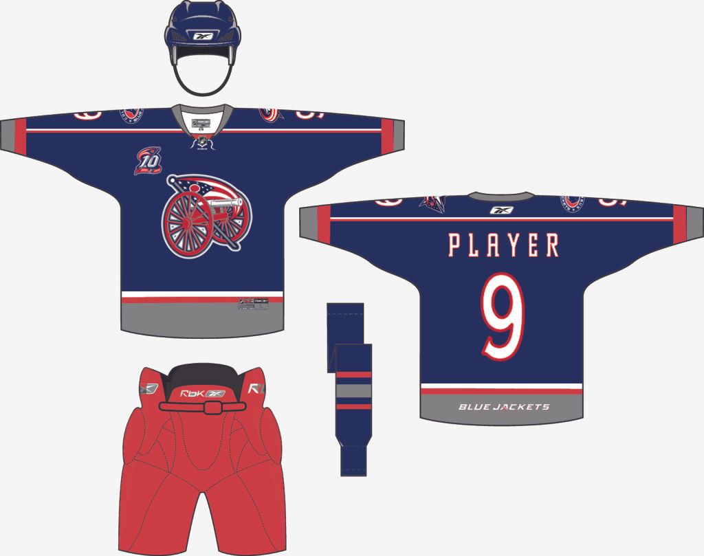
- The front will likely have a cannon-themed logo
- The design will be "old school"
- The Blue Jackets have had this "crossed cannons" logo floating out there for a while.
- Chris Clark likes the colors. (No link on this one, but I recall it from coverage of his visit to a local library.)
- Oh yeah, the colors and "artillery" reference of this - from the Blue Jackets themselves:
Then, thanks to the info-hounds at HF Boards, we have this nugget:
Here's the hat in question:Here's been my guess for the whole early part of the season. You know those new cool [CBJ Foundation] Hats for Heroes hats, that are really dark blue, with the star on them, with the little striping on the very front middle of the bill? That striping color is the new main color. It's a brighter blue than 'union'.
Hmmm...I think we're onto something. But, of course, I could be wrong. I have been almost all the way through this parlor game, you know...
So an enterprising (and much more talented than me with graphic design software) forum member at SportsLogos.net took that hat design and ran with it:Now it doesn't have the crossed cannons, so let's see if we can replace that star logo and use the cannons (and please pardon the poor graphics work on the cannon...I'm not proficient enough to take a curved logo and "flatten" it for this jersey template...but hopefully you get the idea):
So that's it...my final guess. I'm sure it's not 100% accurate, but something resembling that is my guess based off of the tea leaves we've gathered thus far.
That's not to say that there haven't been some great concepts floating around (like the one above - not mine, silly!). DBJ blog reader Avi Stein shared this one with me and, while I don't think the CBJ will go in this direction, it's fun to share:
OK, so what are your thoughts? Predictions? Links to other cool concepts?
[UPDATE: I'm wrong again, but apparently not as badly as in other predictions. Here's the link to The Dispatch's piece on what the jersey will look like. Really, if they had waited another year to launch the jersey, I'd bet that I would have nailed it. :-) ]


Folks, the intro page to the CBJ web site is telling you all we need to know: blue jersey, w/ gray as second color, white lettering (please note the font), some black trim/detailing. Artillery reference = cannon logo. See the gray star behind the Tim Horton's Jackets Pack logo? It'll have those on it too. There, your welcome.
ReplyDeleteSincerely,
Gregstradamus