Greetings Blue Jackets fans, I twitter under the name En4cer45 and Mr. Dark Blue Jacket is being kind enough to let me speak my mind about what I would like to see as the Columbus Blue Jackets unveil a new 3rd jersey this November. Now everyone knows the Blue Jackets started off with the CBJ logo with a neon green hockey stick as a J.
Then during the 03-04 season we unveiled our first 3rd jersey featuring the logo that would become the franchise’s current logo:
So during the February 23rd edition of puck-rakers: “Reebok has been handed design ideas by the Blue Jackets regarding the third sweater, to be unveiled next season. The club expects to get a prototype back from the sporting goods' supplier shortly. Local retailers have already been asked to submit orders. The Dispatch has been told by a high-ranking front-office member that the new duds will be unveiled next November.”
Now Aaron Portzline makes it sound like we’ve already decided on a few ideas and the prototypes are being made as we speak. Now these are just my opinions and my only previous jersey designing experience is on the EA Sports NHL series of games. Also note that my examples I’m including team’s home and away jerseys not just their alternates. So here goes these are my do’s and don’ts for the new 3rd jersey.
DO'S
- I think a red jersey would be a nice change. It would stand out in a normal CBJ fan’s closet of blue and white jerseys. But the Detroit rivalry, probably made the people in the front office not even give this a moments thought.
- I think a lot of fans agree with me on this, CANNON!!! Even if it’s just a shoulder logo I think our favorite item in section 101 should be represented.
- A soldier logo would be good as well, something like the Brampton Battalion of the OHL...
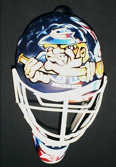
...but grunge him up a little bit, and obviously the hat would have to change. Something like Marc Denis’s 2nd Blue Jackets mask.

DON'TS
- No College style jerseys like the Trashers 3rd jersey or the Stars jersey that just has DALLAS across the front.
These are professionals not guys playing on Friday and Saturday nights.
- This could probably could go with the last one but no nickname jerseys, I mean like the Lightning’s BOLTS jersey or the Senator’s SENS jerseys.
In other words, no JACKETS jersey please!
- No diagonal name on the jerseys, I mean the Rangers are the only team that should have that on a jersey.(I’m looking at you Colorado Avalanche!)
- The logo in a circle is getting old fast, I mean off the top of my head I can think of 5 teams with a jersey like that. I’m leaving out the Oilers, Islanders and Bruins because those 3 are classics. Also, I know 2 of the teams i'm including in the 5 are throwbacks but still.
- And last but not least, the thing that for some reason bugs me about a lot of new jerseys. NO NUMBERS ON THE FRONT!!! I don't know why teams think this looks good and it doesnt help anyone other that the Refs maybe identify the player. Also if the player is either a captain or alternate captain it makes the jersey look cluttered.
- One other idea I would've thrown out was a less cartoony version of the Sarnia Sting logo with Stinger.
But sadly the organization has disallowed any knowledge of our favorite bug other than as a mascot.Now these are just my ideas/opinions and with how my opinions normally go with the Blue Jackets and the NHL, they'll use all my don'ts and hate all my do's.
Anyhoo, I thank you for taking the time to read my first attempt at a blog!


LOL, i think our lists of wants/don't wants are about opposite. If they bring stinger back on the jersey, I might die. A crazy cartoon person would also make me ashamed to be a blue jackets fan...
ReplyDeleteI would like a red jersey but I think because of detroit/OSU they wouldn't do that.
i also don't want it to be white, though. I hate the road jerseys enough.
I like the circle logos and the "dallas" one. agree about no nicknames (beside maybe "cbj").
I really like the current one. Maybe because it captures more than just the city, but rather the entire state. (Which is kinda where "Blue Jackets" came from.) The current one's just clean, crisp and in my opinion, very pleasing to the eyes.
ReplyDeleteMaybe something akin to the old Cleveland Barons logo?
ReplyDeleteSo, how do you distinguish between a "classic" and a "throwback?" I get the feeling you are saying a classic is a previous logo that a team is using again, whereas a throwback is a new logo meant to look old. If that is what you mean, then I would like to point out that the Pens logo on their third jerseys is actually the logo used during the team's 2nd through 5th seasons in the NHL (1968-1972).
ReplyDeleteI agree that some teams are jumping on the circle logo bandwagon. Especially teams like the Wild and the Panthers who haven't been around that long. They aren't old enough to have a classic logo to put on a third jersey. I would classify them as copying the circle logo.
Obviously you see that I am a Pens fan, which means I am a little biased. :-)
Just another thought - you have a lot of pics of logos on this page. I hope you got permission to do so. As the Blue Jackets have made clear recently, no one (not even a politician) can use their logo without infringing on their intellectual property. Just sayin'.